

87% of Australian arts and entertainment venue websites fail basic accessibility checks.
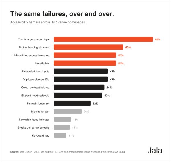
We analysed 167 arts venues and performing arts company websites across Australia to understand the current state of accessibility. Only 22 sites passed a standard automated accessibility assessment. The median homepage took 11.4 seconds to load its main content on a mobile phone and while 63% of venues published an accessibility statement, many still had significant barriers for users.
These aren’t obscure technical issues or best practice recommendations. They affect whether someone can find your next performance, read essential information or complete a booking. For a sector that invests heavily in accessible experiences through Auslan interpreted performances, audio description, wheelchair seating and Companion Card programs, the website is too often the least accessible part of the patron journey.
Why we did this
At Jala Design, we build design and develop custom WordPress websites for arts and entertainment organisations across Australia. We wanted to understand how the sector was performing as a whole, not based on the sites we’d worked on, but on real data from venues across the country.
We expected the usual spread. Some strong sites, some weak ones, most in the middle. What we did not expect was how consistent the failures were, or how little the outcome had to do with a venue’s size, budget or profile.
This is not a name and shame exercise. No individual venue is identified anywhere in these results. The point is to show where the bar actually sits, and to give anyone running a venue a clear picture of what to check on Monday morning.
How we tested
We analysed 167 arts venue and performing arts company websites across all eight Australian states and territories. The sample included state theatres, concert halls, arts centres, entertainment centres, regional performing arts centres and resident performing arts companies operating their own venues. Organisations ranged from local councils and state government trusts through to universities, commercial operators and independent not for profit organisations.
Each homepage was tested in a real Chrome browser using a mobile viewport. We dismissed cookie banners where possible, scrolled the full page to trigger lazy-loaded content and then assessed each site against:
- Accessibility using automated WCAG testing
- Structure including heading hierarchy, page landmarks, language settings and skip links
- Forms and links including form labels and accessible link names
- Keyboard navigation including focus indicators and keyboard accessibility
- Mobile usability including responsive layouts and tap target sizing
- Performance using Google PageSpeed Insights
- Content quality including a manual review of whether image descriptions were genuinely useful
It’s important to understand the limitations of automated testing. Automated tools typically identify only 30 to 40% of accessibility issues. A website that passes these tests has cleared the machine detectable baseline. It should not be considered fully accessible or WCAG compliant. If anything, the real picture across the sector is likely to be worse than these results suggest.
All findings are reported as aggregated totals and percentages. No individual venue is identified anywhere in this report.
Run a venue? Get your own results at the end →
The headline finding
Only 22 of the 167 websites we assessed met a basic accessibility baseline.
We used a widely recognised accessibility testing tool based on the Web Content Accessibility Guidelines (WCAG), the international standard for making websites accessible to people with disability. A “pass” simply means no critical or serious issues were detected by the automated assessment. It’s a low baseline that identifies common problems such as missing image descriptions, poor colour contrast, unlabelled form fields and incorrect heading structure.
The results were consistent across the sector:
- 145 websites did not pass the assessment
- 82% had at least one serious accessibility issue
- 47% had at least one critical accessibility issue
- The typical website contained four separate issues, while the worst recorded 15
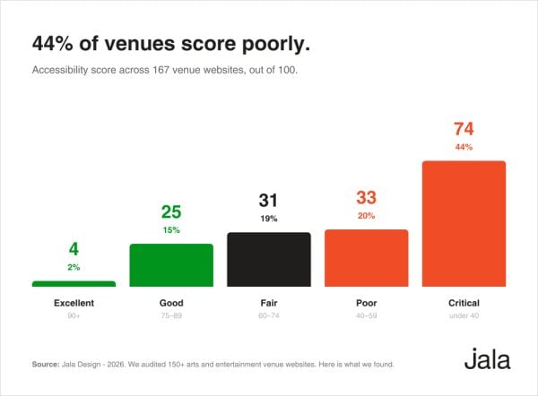
To better compare sites, we also assigned each website a weighted score out of 100 based on the severity and volume of issues identified. Nearly half of all venues (44%) fell into the Critical category, scoring below 40. At the other end of the scale, only 2% scored above 90.
Around one in five Australians live with disability. Your website is part of your service, just like your venue. If someone can’t find information or complete a booking online, they rarely tell you. They simply don’t come.
What is actually broken
Here are a few examples from the audit. All have been anonymised.
- One regional venue had 57 of its 62 images with no image descriptions. A screen reader user gets nothing. Not the show, not the date, not the venue.
- One website had 112 links that a screen reader would announce as “link” with no meaningful name, mostly icon links and image tiles.
- One homepage used 42 H1 headings. There should generally be one. It’s like a book where every paragraph is labelled as the chapter title.
- On 25 websites, keyboard users couldn’t see where they were because buttons and links had no visible focus indicator.
22% of venues disabled pinch-to-zoom on mobile, preventing many low vision users from enlarging text.
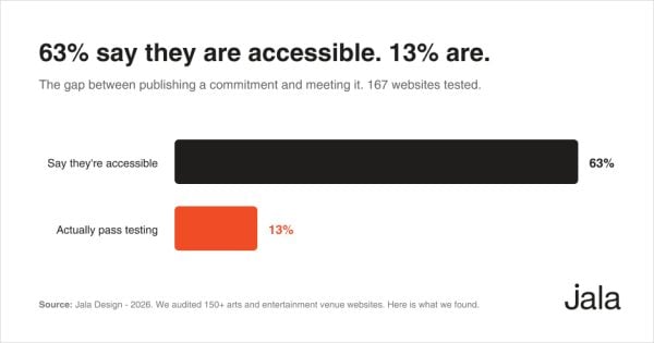
Across all 167 homepages, we found 1,457 buttons too small to tap comfortably, 1,076 links with no accessible name and 310 images with no description.
Want to know how many of these are on your site? Request your venue’s results →
The encouraging part is that none of these issues require a website redesign. Image descriptions, form labels, heading structure and keyboard focus are all straightforward content or template improvements. They’re inexpensive to fix and even cheaper to get right from the start. They persist because they aren’t routinely checked after launch.
The gap between saying and doing
This is the finding we keep coming back to.
More than half the sector publishes an accessibility statement on a website that doesn’t meet its own commitment. Yet the presence of a statement was only weakly linked to the outcome. Venues with an accessibility statement scored an average of 47 out of 100. Those without one scored 43. Among the venues that published a statement, around half still had unlabelled form fields and nearly half had colour contrast failures.
We don’t see this as a lack of intent. If anything, it highlights a disconnect between accessibility policy and website delivery. Publishing an accessibility statement is important, but it needs to be backed by ongoing testing, maintenance and accountability.
Not sure whether your own statement matches your site? That’s exactly what we’ll tell you. Find out where your venue sits →
Descriptions exist. They just are not useful.
Passing an automated image accessibility check only confirms that an image description exists. It doesn’t tell you whether that description is actually useful.
We manually reviewed image descriptions against the images they described. Only 4% of venues had descriptions we considered genuinely helpful. Nearly half were poor. The most common pattern was describing the photograph rather than the event. A description like “Dancer in a red dress against a black background” tells a screen reader user nothing about what’s on, when it’s happening or why they might want to book. We also found raw file names like slider-6.png and placeholder text such as “image description” published as alternative text.
Performance reaches the very top
Only 3% of sites scored 90 or above on Google’s mobile performance test. 47% scored below 50.
The single most useful measure of website performance is how quickly the main content appears. Google considers anything under 2.5 seconds to be good. Over four seconds is considered poor.
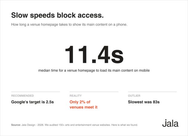
The median venue homepage took 11.4 seconds. Only 2% met Google’s 2.5 second benchmark. Thirty four sites took more than 20 seconds, 12 took more than 30 seconds and the slowest took 83.
Size and reputation offered little protection. Some of the slowest websites belonged to well known, well funded organisations. Every extra second increases the chance that a patron leaves before your content appears. By 20 seconds, many have already given up.
The build matters more than the platform
We recorded the platform behind each site, and the clearest pattern was not which platform a venue used. It was how carefully the site was built on it.
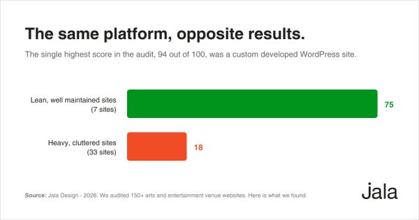
ke WordPress, the platform we build on ourselves and which powered a large proportion of the websites in this audit. Scores ranged from 0 to 94. The highest scoring website in the entire audit was built on WordPress. So were some of the lowest.
The difference wasn’t the platform. It was how the site had been built and maintained. Lean, well maintained WordPress websites with a restrained use of plugins, sliders and third party scripts averaged 75. Heavier, more cluttered websites averaged 18. That’s a 57 point gap within the same platform, far greater than the differences between platforms.
We also looked at page builders, expecting them to be a significant factor. They weren’t. Websites built with tools such as Elementor performed no worse, on average, than those without a page builder. The tool wasn’t the deciding factor.
The takeaway was consistent across every platform we tested. A well built, well maintained website can be accessible regardless of the technology behind it. The opposite is equally true. Accessibility is the result of good decisions during design, development and ongoing maintenance, not the platform itself.
We build and maintain accessible WordPress sites for venues. If yours needs a second look, get your audit results →
The ticketing layer
Ticketing is where most venues hand the patron to a different system, and it is where accessibility work most often stops.
The sector is well served by specialist ticketing platforms. ENTA, Spektrix and Tessitura all have a strong presence across Australian venues, alongside Ticketmaster, Ticketek and TicketSearch. Each brings different strengths, but one finding stood out: no platform consistently outperformed another on accessibility. The same issues appeared across all of them.
The difference wasn’t the ticketing platform. It was how well it had been integrated.
Venues that carried their branding, navigation and accessibility standards through to the booking journey generally performed better and delivered a more consistent experience. Those that redirected patrons to a generic ticketing page or a disconnected subdomain often introduced new accessibility barriers. In several cases, a booking link opened a raw gateway page with a long coded web address, no context and no clear way back.
The booking journey is the most important part of a venue’s website. It deserves the same level of design, accessibility and attention as every other page.
How operator types compare
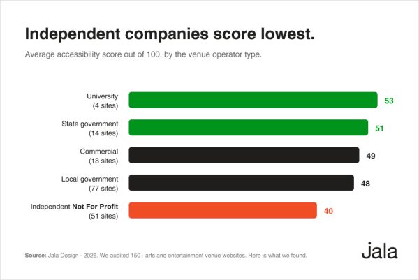
Council-run venues performed best overall. Independent not for profit organisations, often operating with the smallest teams and budgets, performed worst across almost every measure, with a pass rate of just 4%.
That result deserves context, not criticism. Many of these organisations operate with limited internal web expertise and competing priorities. If anything, the findings suggest that accessibility is often constrained more by resourcing than by technical capability.
We would be cautious about drawing conclusions from the university and state government groups. With samples of just four and 14 websites respectively, a single site has a significant impact on the averages.
Regional venues outperform city venues
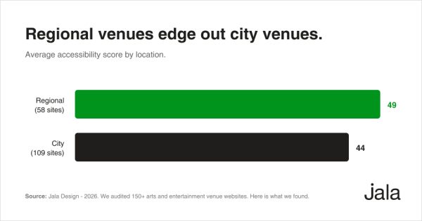
This was one of the more surprising findings. Regional venues generally outperformed their metropolitan counterparts. One possible explanation is that regional venues often run simpler websites, with fewer third party widgets, integrations and interactive components. Larger city venues tend to operate more complex digital ecosystems, and every added feature introduces another opportunity for something to go wrong.
Complexity has a cost. Part of that cost is often paid in accessibility.
How does your state or territory compare?
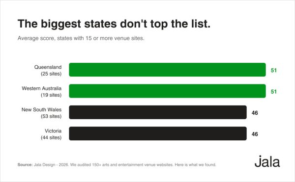
We can only draw meaningful comparisons where the sample size is large enough. Four states met that threshold: New South Wales (53 websites), Victoria (44), Queensland (25) and Western Australia (19). South Australia, Tasmania, the ACT and the Northern Territory had too few venues to compare fairly. In one case, multiple venues also shared a single website, making the results less representative. Rather than overstate the findings, we’ve excluded those states and territories from the comparison.
Among the four larger groups, a few patterns emerged.
Queensland and Western Australia led the group overall. Both recorded the highest average score across the four states. Queensland also had the highest pass rate and the greatest proportion of venues publishing an accessibility statement, making it the strongest performer on several key measures.
New South Wales and Victoria sat mid-table. Despite being home to the largest number of venues and many of Australia’s best known organisations, both finished behind Queensland and Western Australia. Once again, size and profile didn’t translate into better websites.
The bigger picture is that no state performed particularly well. Even the strongest group saw only around one in four websites meet the accessibility baseline. This is a national challenge, not a regional one, and the opportunities for improvement are remarkably consistent across the country.
What separates the better sites
The highest performing websites had a lot in common:
- A single top level heading with a logical heading hierarchy
- Form fields with clear, accessible labels
- Image descriptions that describe the event, not just the photograph
- Visible keyboard focus indicators that had not been removed
- Mobile-friendly layouts with no horizontal scrolling
- Restraint in the use of third party scripts, sliders and overlays
The common failures were just as consistent:
- Buttons and tap targets designed for a mouse, not a thumb
- Icon links with no accessible name
- Heading levels used for visual styling rather than document structure
- Keyboard focus indicators removed without a suitable replacement
- Pop-ups, from cookie banners to newsletter prompts, that trapped keyboard users
- Large, unoptimised images leading to slow page loads
The pattern was clear. Structure mattered more than budget. Several council-run venues with simple, well maintained websites outperformed nationally recognised organisations with far greater resources.
A note on the data. Several websites in this audit were built by Jala Design. We assessed them exactly the same way as every other website, with no adjustments or exclusions.
Accessibility isn’t a badge you earn at launch. Without ongoing maintenance, even well-built websites can fall behind.
Frequently asked questions
Does my venue legally have to be accessible online?
Is automated testing enough?
We just redesigned. Are we fine?
What does it cost to fix?
Find out where your venue sits
Your venue is almost certainly in this data. We have not named anyone publicly, and we will not, but we are happy to tell you your own results.
Tell us your venue and we will send you what the audit found. Your accessibility score, where you sit against the sector, the specific issues on your homepage, and what we would fix first.
This is not an automated report. No AI summary, no generated PDF, no drip sequence. I will open your site myself, read your results, and write back with what I actually think. That includes where I think the audit was unfair to your site, because on some sites it was. If there is not much wrong, I will tell you that. It is a short email either way.
Request your venue’s audit results
About the author

Jarrad Langdon is the Managing Director of Jala Design, specialising in strategic consulting across the full website lifecycle including strategy, design, development and ongoing optimisation. He works closely with organisations to deliver high performing, accessible and scalable digital platforms that drive measurable outcomes, with a strong focus on usability, conversion and long term growth. His approach is grounded in practical digital transformation, helping businesses streamline systems, improve workflows and make informed technology decisions supported by data.
Alongside his agency work, Jarrad has a long standing involvement with WorldSkills, where he is a past international gold medallist in Website Development and has contributed as a board member, judge and International Chief Expert, as well as mentoring medal winning competitors. He also brings over 15 years of teaching experience at TAFE, supporting the development of future web professionals.